
Packaging | Branding | Illustrator

Heatwave Icecream
Heatwave offers a one-of-a-kind ice cream experience, beyond indulgence, it actively promotes awareness of global warming and sustainability through its thoughtfully designed packaging, which incorporates eco-friendly materials and visuals that highlight environmental issues.

The hand-drawn logo, featuring letters that appear to be melting, reinforces the theme of global warming. The retro color palette of blues, pinks, and yellows makes it stand out on the shelf compared to other ice cream brands that tend to use darker colors.

To simplify the complex concept of global warming, I designed the packaging for Heatwave, a brand that offers delicious frozen treats while promoting environmental awareness. The goal was to create an engaging visual narrative that resonates with consumers, helping them understand the impact of rising temperatures through relatable imagery of melting ice cream.


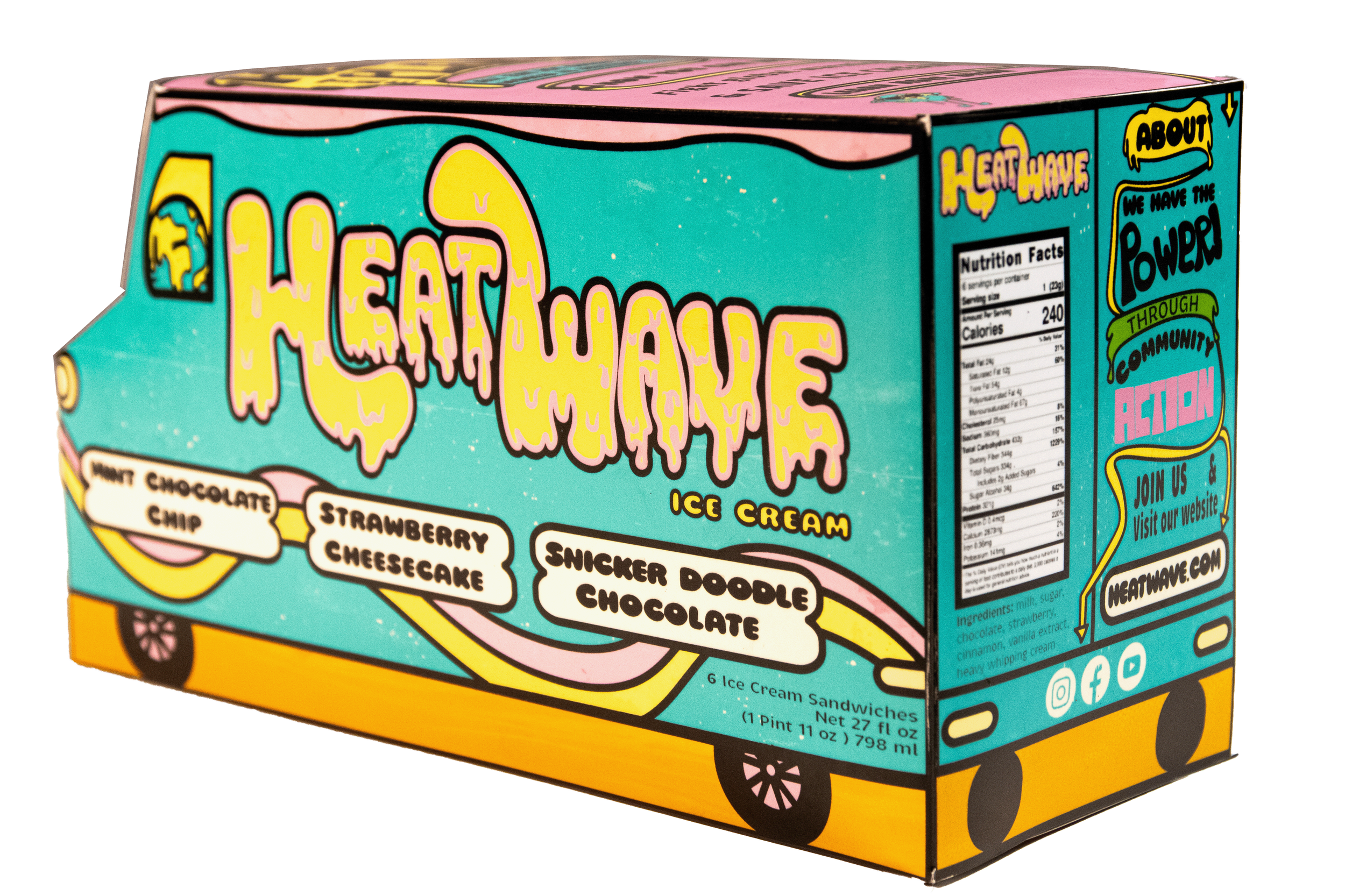
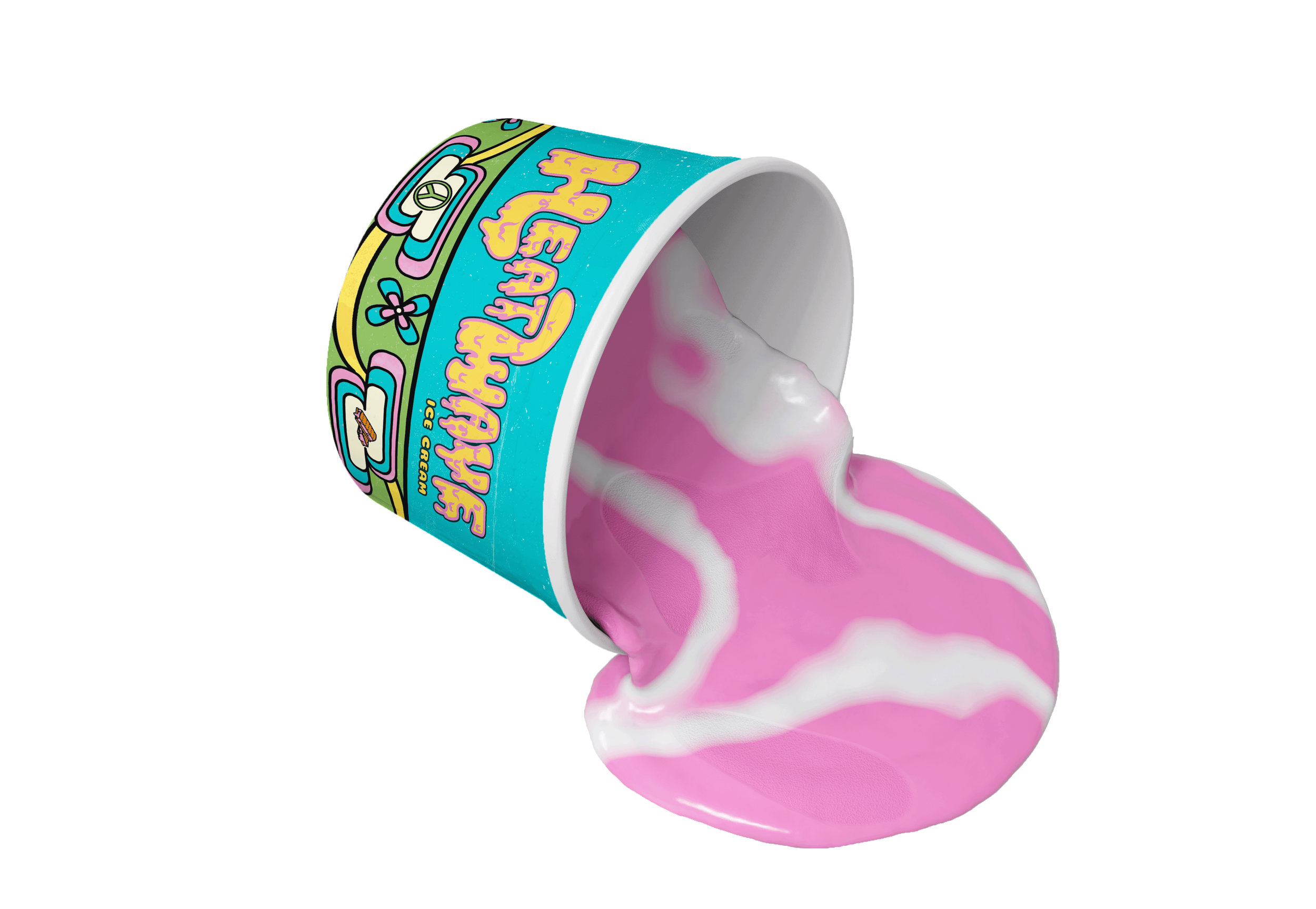
A melting planet character serves as the brand’s mascot. The packaging features a vintage ice cream truck that swings open to reveal delightful melting ice cream sandwiches inside. The truck embodies a 70s-inspired flower power pattern with playful ice cream details.


Heatwave not only offers delicious treats but also sparks conversation and awareness around climate change.
Process

Sketch of the packaging features a vintage ice cream truck that swings open to reveal delightful melting ice cream sandwiches inside. And a melting planet character serves as the brand's mascot.
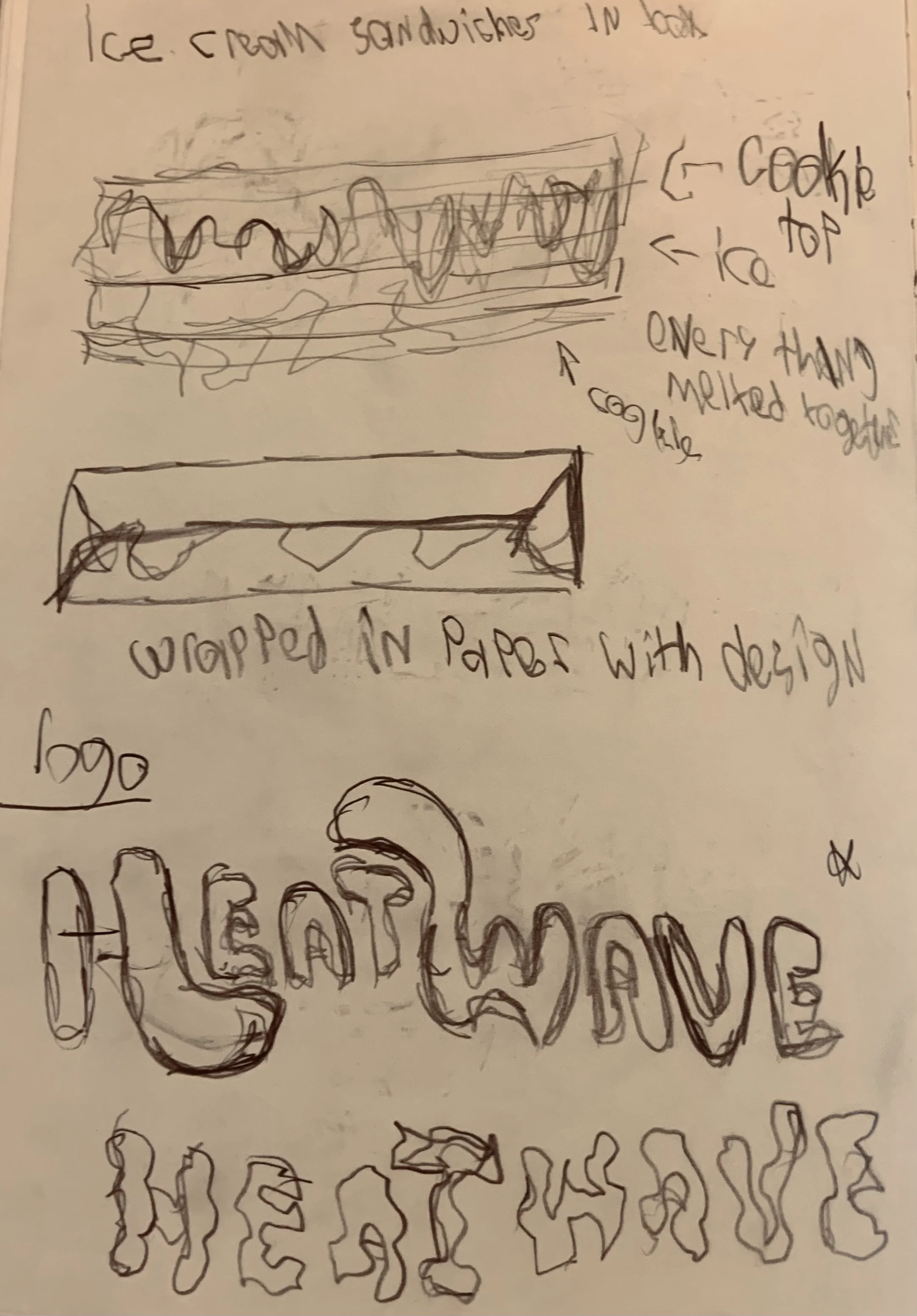
The hand-drawn logo, featuring letters that appear to be melting, reinforces the theme of global warming.
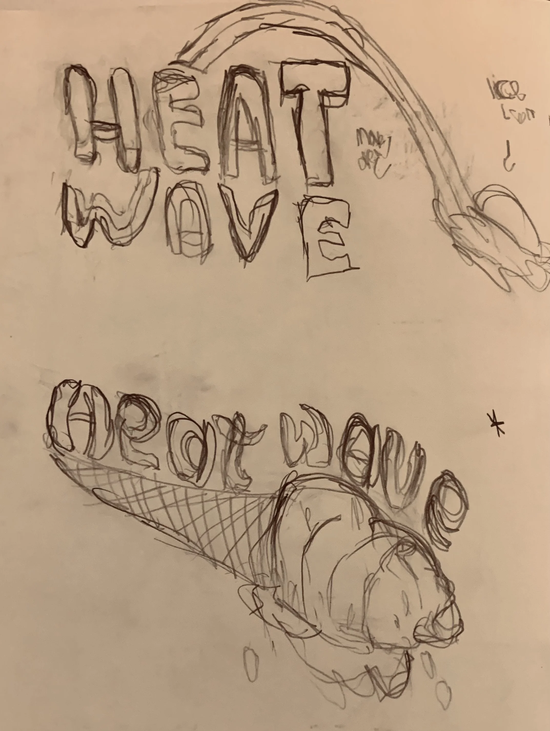
More hand-drawn logos
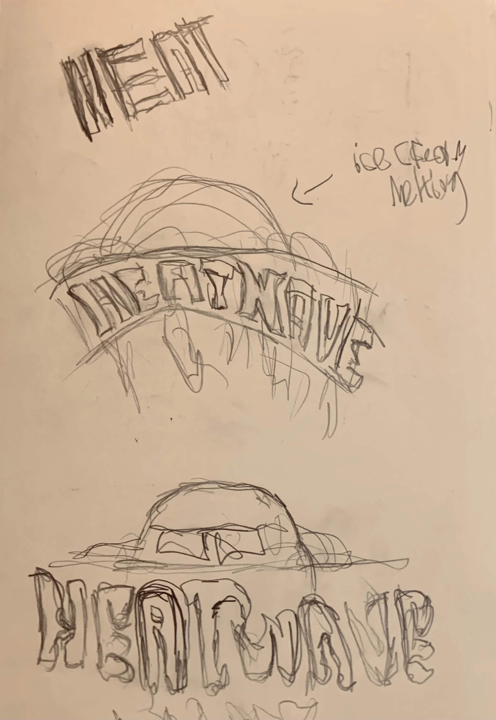
More hand-drawn logos
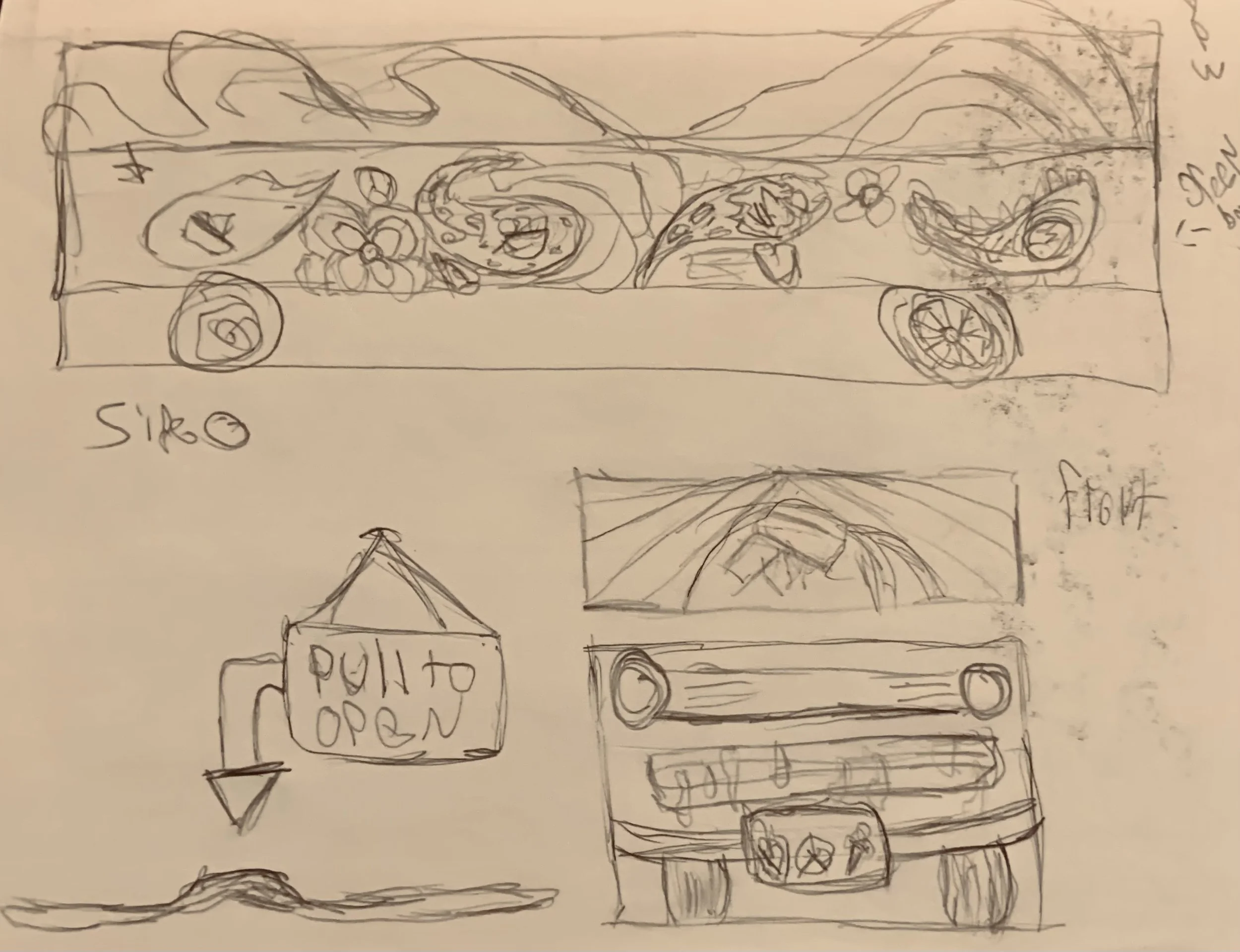
The truck embodies a 70s-inspired flower power pattern with playful ice cream details.

Making the typography feel both unique and approachable, aligns with Heatwave's mission.
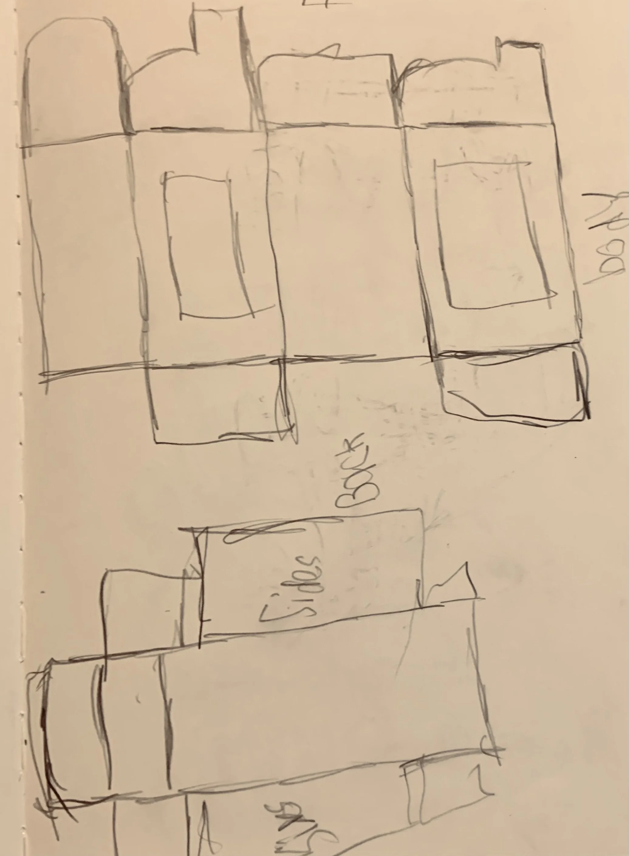
Sketches of the dieline of the truck.

Rough draft of the packaging.