St. Petersburg Chiropractic
Illustrator | Website | Logo
Client work
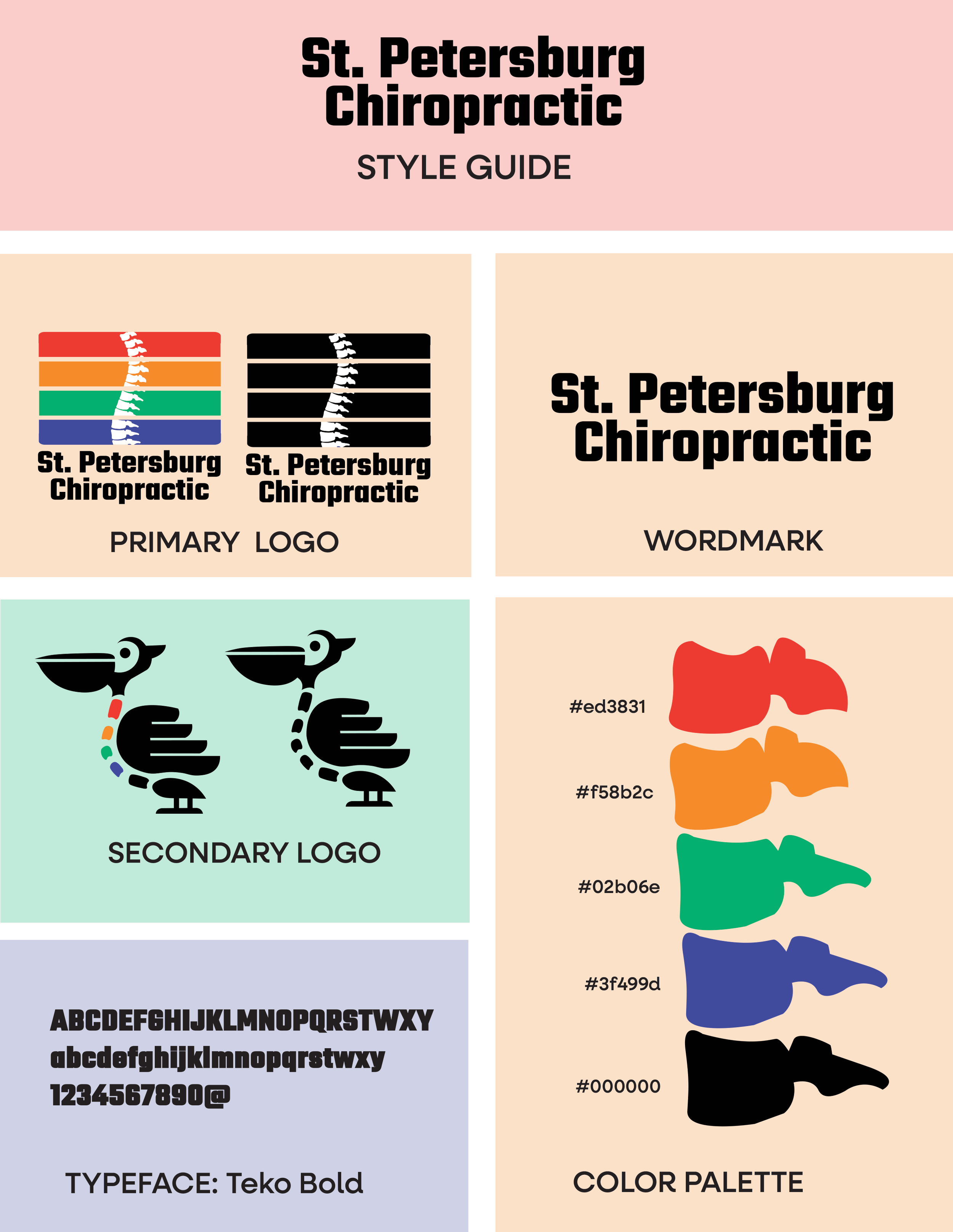
A brand and website design for a local chiropractor launching their practice, highlighting their connection to the St. Petersburg community.
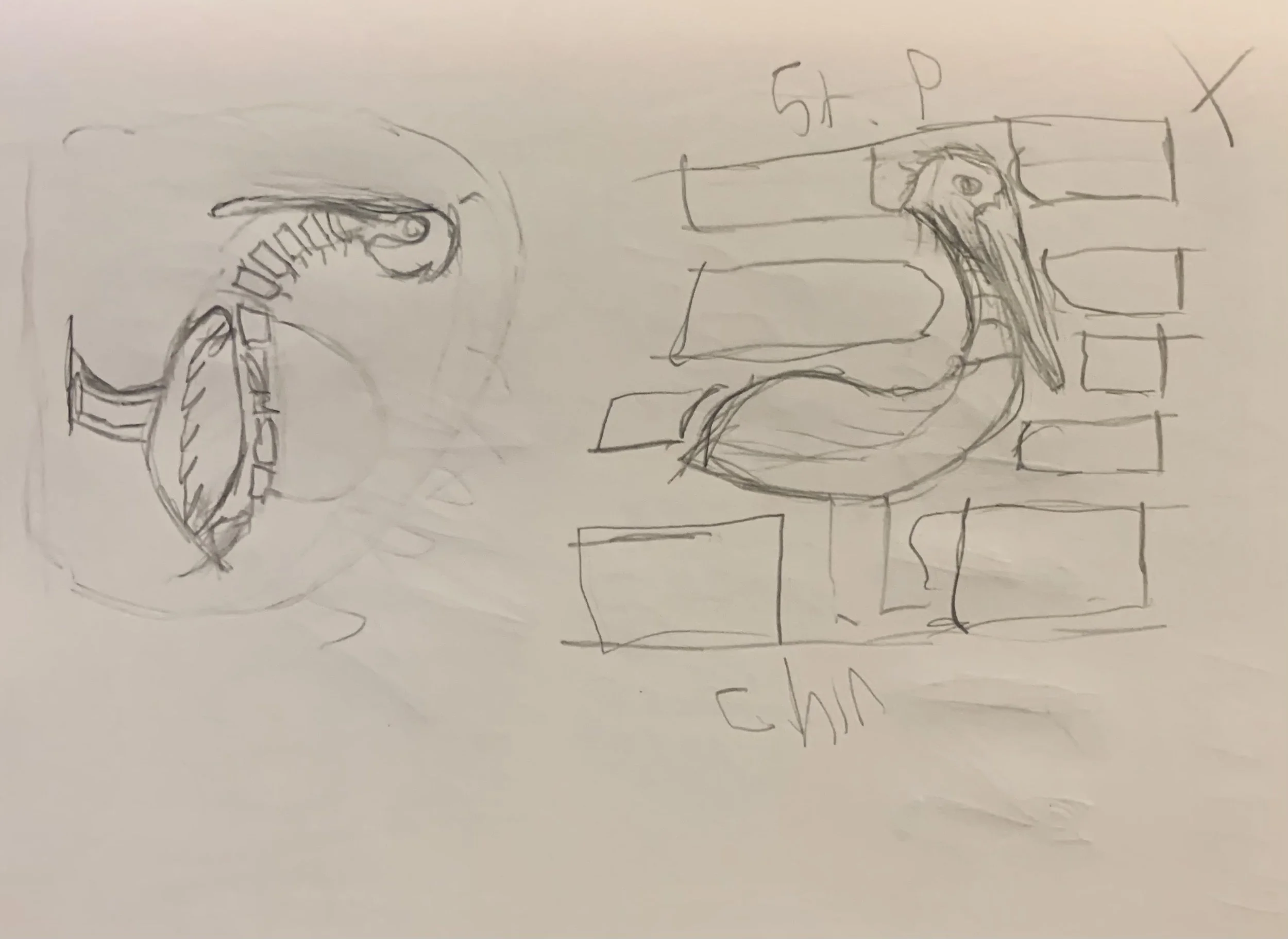
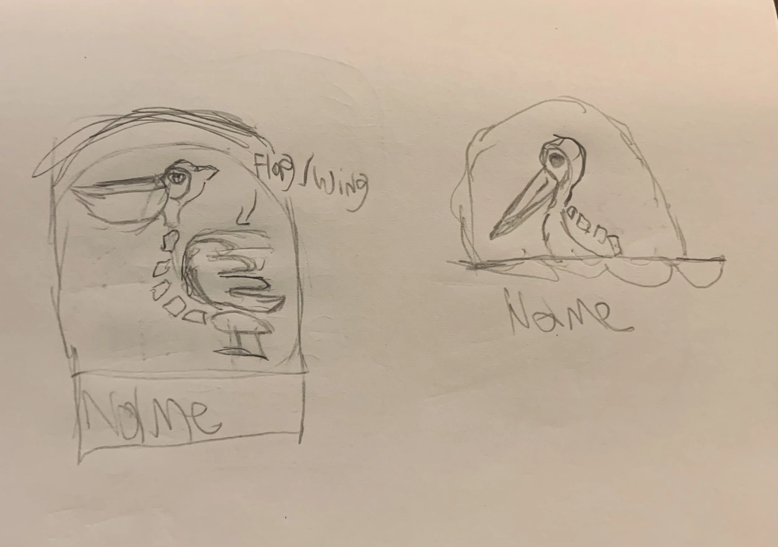
This project had a strict deadline of two months to ensure the clinic opened on time. The design focuses on highlighting the chiropractor's connection to the St. Petersburg community. Initially, the main logo featured a pelican with a spine, inspired by the pelican on St. Petersburg's flag. However, based on client feedback, it has since been revised to concentrate solely on the spine for simplicity, and the pelican spine has become the secondary logo.
I selected a bright color palette inspired by various areas around St. Pete. The logo incorporates a block design, which has been utilized on the website to organize different sections, such as treatment plans, making it easy for patients to navigate.
Additionally, the clinic is considering expanding to include a gym, and I created mockups to illustrate what that could look like in the future.


